Sunday, August 15, 2010
Friday, August 6, 2010
Sunday, August 1, 2010
Thursday, July 22, 2010
Filter Fun & Dodge & Burn (Week 9)
The first two sets of photos are my dodge and burn photos. In the pictures of the rocks I highlighted the rocks and darkened the background, especially the man who was standing on the beach. In the pictures of the door I highlighted the white frame of the door, left the door to its original color, and darkened the window.


These are my filter pictures. For the landscape with the fence and seagull I used the color pencil and artistic strokes, which I set to go diagonally. In the picture of the beach chair I used water colors and used artistic strokes again. Then I hardened the edges and increased the number of strokes to make it look more like an actual water color.
Saturday, July 17, 2010
Colors in Photoshop & Mosaic Art
I used photoshop this week instead of gimp and I have to say I am a much happier person because of it! This is what i did this week:


The original is on the left. I really like this picture, and i think the flowers are beautiful, but I wanted to see what i could do with it. First, I played with the vibrant button, and made it ALOT more vibrant. Then, I upped the saturation almost as much as possible, which really brought out the great colors in the flowers. Then, I decided to play with the hues and saturation again (my favorite tab, I think) and I came to this color combination of blue and red, which I found really fun to look at. I don't like photos that are obviously manipulated, I liek natural looking ones. But I thought this was too cool to not post to my blog.

This is all the same picture, but I wanted it to seem as if I had taken a picture in the summer, early fall, and late fall. To get these effects I played with the hues and saturations. I then selected the part with just the leaves and colorized it.
For this picture (the original is on the left) I was never very happy with it but for some reason
I keep coming back to it. I thought it would be fun to play with in photoshop. I played with the brightness and contrast, adding a lot of brightness and a bit of contrast. Then I added a lot of saturation and played with the hue bar until I was happy with the colors.
I keep coming back to it. I thought it would be fun to play with in photoshop. I played with the brightness and contrast, adding a lot of brightness and a bit of contrast. Then I added a lot of saturation and played with the hue bar until I was happy with the colors.


The original is on the left. I really like this picture, and i think the flowers are beautiful, but I wanted to see what i could do with it. First, I played with the vibrant button, and made it ALOT more vibrant. Then, I upped the saturation almost as much as possible, which really brought out the great colors in the flowers. Then, I decided to play with the hues and saturation again (my favorite tab, I think) and I came to this color combination of blue and red, which I found really fun to look at. I don't like photos that are obviously manipulated, I liek natural looking ones. But I thought this was too cool to not post to my blog.
And here is my mosaic:

Sunday, July 11, 2010
Photoshop Editing
Sorry that I'm posting this so late in the week, I haven't had access to a computer that I could download photoshop onto until today. In this first photo I edited out the wires in the top corner by using the clone tool and then I added in a boat from another picture that I had taken at the other end of the lake.
This next picture was a landscape of some mountains that I took. I cropped the picture and played with the colors so that the green and blues came out a bit more. I thought that by developing the colors and making the photo look "sunnier" the textures of the trees really came out, and it looks very soft.
Thursday, July 1, 2010
Landscapes


This week I was on vacation in Rhode Island so I had to photograph scenery that I was not used to, which at first really uninspired me. I attended an art show on Sunday in Narragansett, though, and studied some of the photography for sale and realized that the scenery around me was actually very inspiring, I just had to stop focusing on the overly common ocean shots that I could capture and focus on taking shots that haven't been taken yet. I got a lot of shots, so I hope that you like them. I'm sorry that I'm posting so many but I had trouble deciding.
I'm not sure that I found out how to take the perfect landscape shot this week, but I know that I certainly learned how to take better landscape shots. One thing that I really focused on (which is probably obvious) is adding a sense of depth to my pictures. I hate flat landscape shots, and I did not want to be a photographer that takes those types of photos. I'm happy with what I took for photos this week, and look forward to even greater landscape shots in the future.
Thursday, June 24, 2010
Centered & "Rule of Thirds" Shots

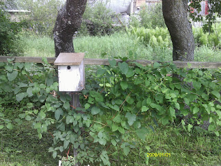
 I took these pictures in my friend's garden. The picture in which the birdhouse is centered is very basic. The picture is obviously of the birdhouse, and that is the object that draws in the eye. In the picture where the birdhouse falls on a line of thirds, the shot is more interesting, but the viewer has to work a little harder to see what the picture is about, even though the birdhouse still attracts the eye. I think it is an all around more interesting shot.

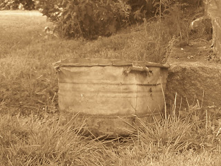
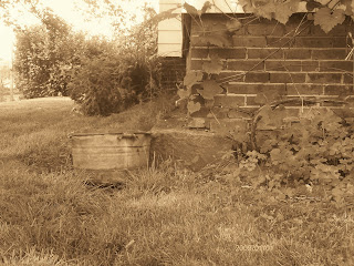
I changed the color of these photos to sepia, because I thought it really fit since the object is an old wash tub. When the wash tub is centered, the picture is only of the washtub, and that is the only thing to look at. In the photo where the washtub falls on a line of thirds, the old building and the plants add more feeling and emotion to the picture. It really adds to the aesthetics (I just wanted to finally use a word I just learned). Everything seems to have an older feel, and the building and plants really add to that. Although the eye is still drawn to the washtub, i think that those other elements are necessary because they help to tell a story.
Composition & Aesthetics
This week I have to talk about either composition or aesthetics of photography. I decided to look into aesthetics, because I had no idea what it meant. Upon further investigation, I discovered that it is basically the beauty of a picture, and how that connects to the viewer's emotions. So, when i studied aesthetics this week, I found I was simply learning how to take a beautiful picture, which is very important for me to know.
I found an essay by Alain Briot at www.luminous-landscape.com/columns/aesthetics-1.shtml that really helped me, not just to understand aesthetics but to apply to my photography. The trick to great aesthetics in a photograph is seeing like a camera. We as humans do not see as our camera sees, which seems very obvious but accounts for why I am constantly frustrated that the beauty i see in front of me is not translating into my photographs. One trick that I learned from this essay is to either shoot through my viewfinder or close one eye. I like shooting through my viewfinder but I think that I will experiment with closing one eye, also.
I also learned from this essay that it is extremely important to recreate depth to create a beautiful picture. This can be done by making sure there is both a foreground and a background in the picture, or to play with overlapping, as we perceive that an object overlapping another is closer to us, creating depth in the photo. Also, there should only be one main focus of the picture, that way there is only one place which the viewer's eye is drawn to and the photo is simpler and easier to understand.
I'm now off to go and use some of the techniques that I have learned this week...
Thursday, June 17, 2010
Monochromatic and Analogous Color Schemes
I took two different monochromatic shots, which have significantly different moods, and that is why I am sharing both of them. The shot of the white rose has a very innocent feel. The shot of the path in the forest has a fantasy-like, sort of "Harry Potter" feel to it.


This next shot is my analogous shot. i used the colors yellow, gold, and black/white. It is of my slide trombone, inspired by my shot from last week of my ukulele, and also by my boredom of photographing flowers. Time for me to up my creativity.

Subscribe to:
Comments (Atom)


