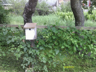
 I took these pictures in my friend's garden. The picture in which the birdhouse is centered is very basic. The picture is obviously of the birdhouse, and that is the object that draws in the eye. In the picture where the birdhouse falls on a line of thirds, the shot is more interesting, but the viewer has to work a little harder to see what the picture is about, even though the birdhouse still attracts the eye. I think it is an all around more interesting shot.

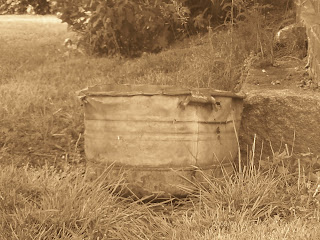
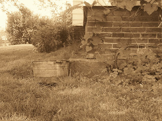
I changed the color of these photos to sepia, because I thought it really fit since the object is an old wash tub. When the wash tub is centered, the picture is only of the washtub, and that is the only thing to look at. In the photo where the washtub falls on a line of thirds, the old building and the plants add more feeling and emotion to the picture. It really adds to the aesthetics (I just wanted to finally use a word I just learned). Everything seems to have an older feel, and the building and plants really add to that. Although the eye is still drawn to the washtub, i think that those other elements are necessary because they help to tell a story.

I like these photos a lot. They really show how using the rule of thirds changes the image and feeling of a photo. Nice touch with changing the wash tub photos to sepia. I like changing photos from color to sepia or b/w. They are so unique.
ReplyDeleteI think it's kind of funny how the trees split the bird house picture into thirds. It's like they were a natural guide for the shot!
ReplyDelete