Thursday, June 24, 2010
Centered & "Rule of Thirds" Shots

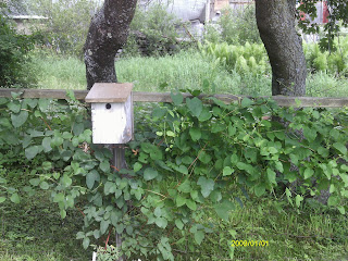 I took these pictures in my friend's garden. The picture in which the birdhouse is centered is very basic. The picture is obviously of the birdhouse, and that is the object that draws in the eye. In the picture where the birdhouse falls on a line of thirds, the shot is more interesting, but the viewer has to work a little harder to see what the picture is about, even though the birdhouse still attracts the eye. I think it is an all around more interesting shot.
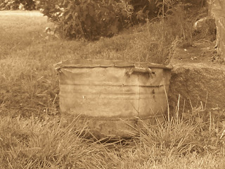
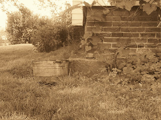
I changed the color of these photos to sepia, because I thought it really fit since the object is an old wash tub. When the wash tub is centered, the picture is only of the washtub, and that is the only thing to look at. In the photo where the washtub falls on a line of thirds, the old building and the plants add more feeling and emotion to the picture. It really adds to the aesthetics (I just wanted to finally use a word I just learned). Everything seems to have an older feel, and the building and plants really add to that. Although the eye is still drawn to the washtub, i think that those other elements are necessary because they help to tell a story.
Composition & Aesthetics
This week I have to talk about either composition or aesthetics of photography. I decided to look into aesthetics, because I had no idea what it meant. Upon further investigation, I discovered that it is basically the beauty of a picture, and how that connects to the viewer's emotions. So, when i studied aesthetics this week, I found I was simply learning how to take a beautiful picture, which is very important for me to know.
I found an essay by Alain Briot at www.luminous-landscape.com/columns/aesthetics-1.shtml that really helped me, not just to understand aesthetics but to apply to my photography. The trick to great aesthetics in a photograph is seeing like a camera. We as humans do not see as our camera sees, which seems very obvious but accounts for why I am constantly frustrated that the beauty i see in front of me is not translating into my photographs. One trick that I learned from this essay is to either shoot through my viewfinder or close one eye. I like shooting through my viewfinder but I think that I will experiment with closing one eye, also.
I also learned from this essay that it is extremely important to recreate depth to create a beautiful picture. This can be done by making sure there is both a foreground and a background in the picture, or to play with overlapping, as we perceive that an object overlapping another is closer to us, creating depth in the photo. Also, there should only be one main focus of the picture, that way there is only one place which the viewer's eye is drawn to and the photo is simpler and easier to understand.
I'm now off to go and use some of the techniques that I have learned this week...
Thursday, June 17, 2010
Monochromatic and Analogous Color Schemes
I took two different monochromatic shots, which have significantly different moods, and that is why I am sharing both of them. The shot of the white rose has a very innocent feel. The shot of the path in the forest has a fantasy-like, sort of "Harry Potter" feel to it.


This next shot is my analogous shot. i used the colors yellow, gold, and black/white. It is of my slide trombone, inspired by my shot from last week of my ukulele, and also by my boredom of photographing flowers. Time for me to up my creativity.

Lighting Effects


 The first picture was taken in a room without lighting other than the windows, without a flash. The second picture was taken under a red lamp, without a flash. The third picture was taken in sunlight, without a flash. I don't like the quality of the first picture, but I think that the red lighting of the second picture has a nice mood-changing effect and the natural light of the third picture has a nice feeling as well.
Thursday, June 10, 2010
Collage of Macro Images
 This week I had some pictures that I really liked, such as the pictures of my ukelele, and some that I didn't think would make good photos at all. Overall, though, I had a lot of fun playing with angles and textures. Simple things can seem so different just by the way that they are photographed. It is so fascinating!
Thursday, June 3, 2010
Week 2: Pictures of the Willoughby Gap
This week i chose to take pictures of the Willoughby Gap from many different perspectives. This included a hike up Mt. Pisgah (I hope that is the correct spelling) and a lot of driving time around the lake. It was really fun. I'm only supposed to compare and contrast two pictures, but I couldn't decide on only two, so I am going to discuss three of the pictures that I took.
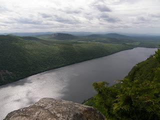
This is the first picture from the overlook at the top of the mountain:

I like this picture because there are three distinct parts of the Willoughby gap which I think are very important. There is the foreground, which is the top of the mountain. This is the rock at the bottom of the picture, which is actually an overhanging cliff, and some trees to the bottom right. Then there is, of course, Willoughby lake, which is shown on a diagonal in the picture, giving a nice overall shape and line to the photo. The last part is the distant scenery, which includes mountains and hills, showing the Vermont landscaping. I am not too crazy about the lighting but I'm happy with this photo since I am still a beginner.
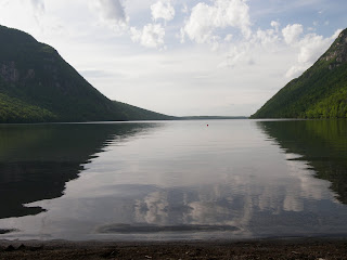
This is the next picture, taken from the south end of the lake:

I like the lighting down the middle of the lake, and the shadows that the mountains are casting. I also like the openness of the photo. It makes the Willoughby Gap seem very vast and open. It reminds me of fresh air and the Vermont spring time. I like the overall feeling of it. However, I feel like there needs to be something behind the gap. I wish that the distant mountains were visible, but they are not from this angle. That would give the picture something more, rather than so much sky.
This is the last picture, taken from a road about a mile before the north end of the lake:
There are two things that I would like to change about this photo. The first is that there are powerlines in the upper left-hand corner, which I can remove with photoshop. Also, I wish that the color of the mountains was a bit more distinguished. It was overcast this day, but usually the blue is lit up with green. I also wish that the photo was taken from a higher elevation so that there were less of the trees and more of the lake. But I think that this shot definitely had potential.
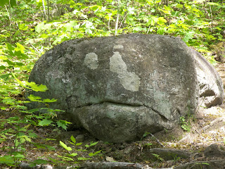
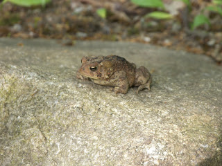
These are just some fun photos I got on my pursuit of great photographing this week:


Subscribe to:
Comments (Atom)


